To understand Acura logo it is important to know the history of the company. Acura was founded in 1986 as a dedicated luxury division of a large Japanese automaker Honda.
From the very start, the company had a unique identity and produced high-end vehicles. The concept of precision was emphasized in its name, slogan, and logo:
- the name of the brand developed by NameLab, was formed on the base of the prefix “acu” (“sharp”, “precise”);
- one of the first slogans the company used was: “Precision crafted performance”;
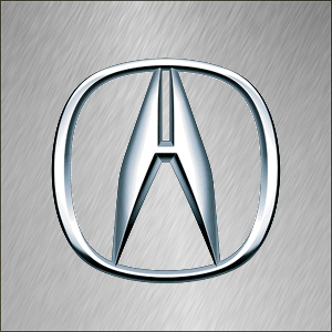
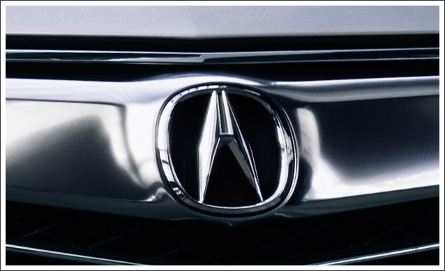
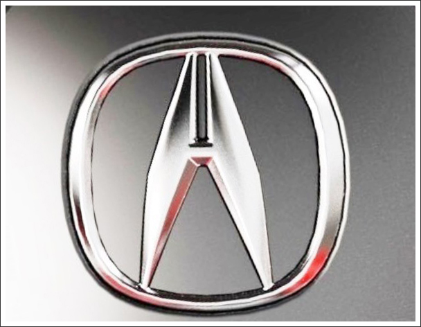
- the Acura symbol also reflects the concept of meticulousness and excellence of the engineering. Actually this emblem represents a measuring tool familiar to every engineer. That is a caliper that helps to make exact, detailed measurements.
The Acura logo can also be interpreted as a stylised letter “A” (the very first letter of the brand’s name). In addition to this, there is one more explanation: the symbol looks a little bit like the letter “H”. That is not just a casual resemblance: it reminds that Acura’s parent company is Honda.
By the way, the first, unapproved version of the Acura symbol did not have the horizontal bar that forms the letter “H”. Soichiro Honda refused to approve this version and because of this five thousand badges already produced were destroyed (more than three hundreds were already applied to cars!).


